My Vision and Yours
I have a passion for finding a visual way to communicate the purpose and vision of your company. I want each of the logos I create to speak a thousand words to your clients about who you are and what you stand for.
My favorite part of the creative design process is meeting you and discussing what you are about, what you want to communicate to the world about who you and your company are. I love watching people get excited about what they do, and I love the look in their eyes when they see that passion reflected in the work I create for them.
My favorite part of the creative design process is meeting you and discussing what you are about, what you want to communicate to the world about who you and your company are. I love watching people get excited about what they do, and I love the look in their eyes when they see that passion reflected in the work I create for them.
|
|
|
Kimballton, Iowa is famous for it's replica of the Little Mermaid in Copenhagen. It sits in a fountain in the city park. At Christmas time they decorate it with wreaths and sometimes scarves!
|
|
|
Shelby County Historical Museum wanted an upgrade of their hand drawn cabins. Now they have a vector image that can be scaled easily large or small.
|
|
|
Next Gen Creations is now opening a branch of home decor doing blinds, window treatments and furniture. They wanted it to be close to their original logo but also have the idea of home goods.
|
|
|
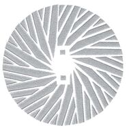
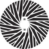
The Danish Windmill's Millstone has a specific pattern to it for grinding grain. Here it is with and without the stone texture.
|
|
|
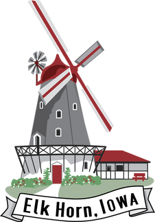
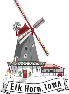
The Danish Windmill in Elk Horn wanted a graphic of their mill that they could use for magnets and mugs and other merchandising.
I did several renditions for them with and without words. As well as a special Christmas edition with a snowman and decorations! |
|
|
Faith Bible Church wanted to include their tagline and location. Together these work nicely below their name.
|
|
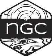
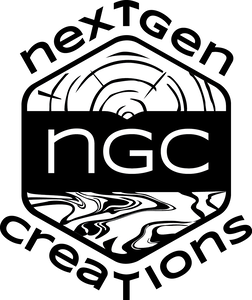
Next Gen creations is a company that specializes in woodcraft and unique furniture combining wood and epoxy elements. At the top there is a wood grain texture, and underneath is an epoxy look. Together they depict a scene with the sun rising above the water, which hints at Creation. Nextgen will use this logo with or without the words.
|
|
|
The DVIO is a group dedicated to inspiring growth in the community. This Danish folk art styled bird nesting in the D is a symbol of good luck and prosperity. The I is topped with a star that has the Danish flag stripes inside it. It hints at a candle sparking inspiration or a flower bringing growth.
|
|
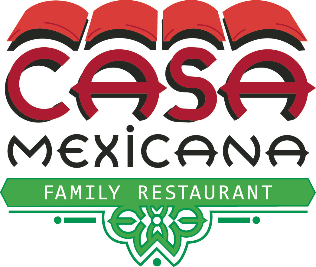
Casa Mexicana is a Mexican Restaurant in Avoca, Iowa.
The Adobe Tiles that echo the shapes of the letters remind me of a Mexican Adobe house with red clay tiles. The design below in the green is made up of the shapes of the letters in the CASA font. It is a shape that is found on hand painted Mexican decorative tiles. |
|
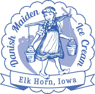
Pleasant Thymes Tea room wanted a product logo for their line of Ice cream. They knew exactly what they were looking for, a vintage milkmaid carrying a yoke. The little Danish milkmaid is carrying her ice cream down the street from her town with a windmill in the background, just like the one in this little town in Elk Horn, Iowa.
On the ice cream itself the design will have a blank banner so the flavor and date can be written on it. |
|
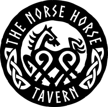
The Norse Horse Tavern wanted a runic image of Schlepnir, Oden's 8 legged horse. It had to be something that could be cut out of metal for a hanging sign, and round to fit on a bar coaster.
|
|

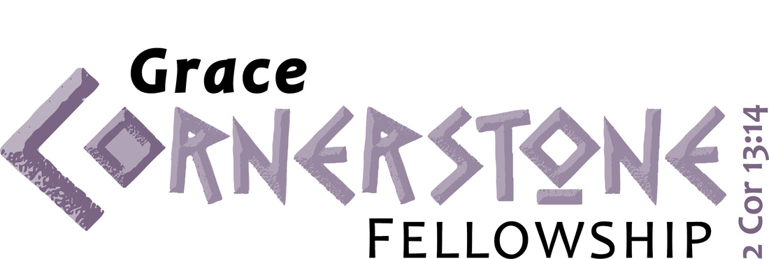
Grace Cornerstone is a new church
that wanted a logo with the feel of an ancient stone. They also wanted a logo to use separate from the words and verse. |
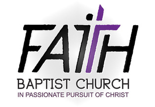
Faith Baptist Church wanted rough around the edges. It is italicized to show movement and hinting toward a person leaning into a cross seen in the white space.
|
Three crosses on a hill make the H.I.M for this Honduras Mission organization.
|
|
A local donut delivery service. The pink line and donut O hint at a car with wheels. There are 6 sprinkles, one for each of her kids. The typeface is one that resembles a newspaper font.
|
|
The Living Fire youth group wanted something with and without words for T- shirts and flyers. The flame is a solar flare and the cross beside it is the x structure from the center of the whirlpool galaxy. Taken without the words it looks like TLF.
|
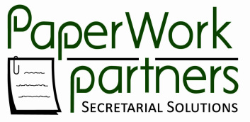
Paperwork Partners is a company that offers secretarial support for businesses who need a temp secretary to manage their paperwork. We went with a paperclip theme because paperclips hold things together the way a secretary keeps a business running smoothly. The client also wanted a cross in the logo somewhere to show that it is a Christian company.
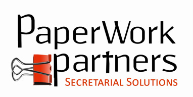
This is another rendition of Paperwork partners that we considered. This one is a bit more clean and simple.
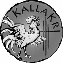
Kallakri is a logo for an author of historical fiction novels for young people. Kallak Kri means "Rooster's Cry." The client wanted it to look like a coin, with the Biblical symbolism of Peter's denial of Christ...the rooster's crow. The moment when Peter realizes he has sinned. That against the scratches symbolizing his redemption; the three crosses.
|
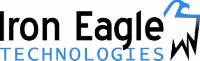
Iron Eagle is the parent company that focuses on the testing and installation of emerging technologies.
|
|
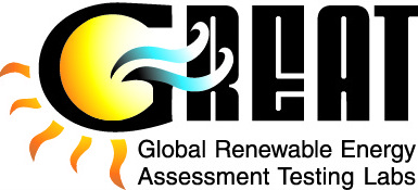
Great is a testing laboratory that tests solar modules and small wind turbines. The client also uses the G by itself as the "Great Mark" showing that it was tested by Great labs.
|
|
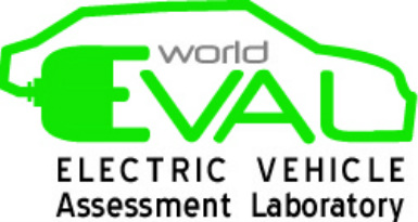
World Eval is a company that tests electric vehicles. |
|
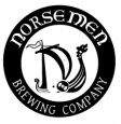
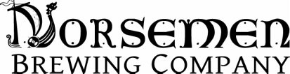
The Norsemen Brewing Company wanted something that could be used on stationary, on signs as well as translated onto a bottle cap for their signature micro brew beer.
|
|
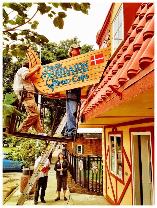
The Thirsty Mermaids Brew Haus eventually became the Brew Cafe.
|
The Danish Windmill in the background and the cross in the forground illustrate the purpose of bringing Christ to the town of Elk Horn.
Luxury Lawn is a lawn care agency. Their idea is that you can have more luxury time if you have them mow your lawn for you.
